
A shared vocabulary.
One idea, a short explanation, and a clear next step. A single rule at the top provides structure.
Read the guideVISUAL SYSTEM / BLUEPRINT FIELD NOTES / V1
Blue drafting sheets. Pencil-like connectors. Handwritten ideas with clean, readable explanations. A visual language for systems that are still being imagined—and carefully built.
01 / COLOR
Blue holds the big ideas. Pale paper carries long explanations. Pencil blue is reserved for annotations on dark surfaces. Reading ink keeps text crisp on light backgrounds.
02 / TYPOGRAPHY
Build what your business means.
Use for editorial headings and short diagram labels. Display: 53–96 px. Section titles: 43–72 px. Annotations: 19–26 px.
Every object has an identity. Every relationship has meaning.
Body: 16–18 px, line height 1.65. Lead: 18–22 px. Keep long prose on calm paper, with a comfortable reading width.
SPECIFICATION → PLAN → RUN → EVIDENCE
Technical labels: 11–12 px. Code: 14–16 px. Use uppercase only for short drawing labels.
03 / DIAGRAM LANGUAGE
Use slightly irregular outlines, clear arrowheads, and short labels. Solid arrows show the main flow; dashed connectors show supporting relationships. Explain the diagram in text and keep decorative grids out of reading surfaces.
STANDARD ICON / B + P
A geometric B and P share a central edge. Use this single SVG for the Blueprint identity across the website, documentation, and presentations.
 Blueprint
Keep the 64 × 64 proportions and at least 8 units of clear space. Use blue on pale paper or white on blue. The wordmark uses Kalam; the tagline uses IBM Plex Sans.
Our shared tagline for the footer, presentations, and social cards.
The same icon, drawn in sequence with Rive. Hover to draw the mark in 0.7 seconds. The complete icon rests between interactions.
Hover, focus, or tap · 0.7 seconds · respects reduced motion
64 × 64 VIEWBOX / BLUEPRINT BLUE #123F91 / PRESERVE PROPORTIONS
The shared 1200 × 630 card for LinkedIn, X, and other link previews. Every documentation page supplies its own title, description, and canonical URL.
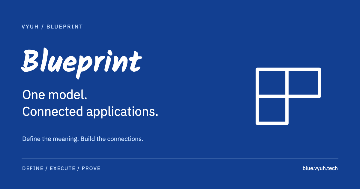
OG / website · en_US · 1200 × 630 PNG · X summary_large_image · @vyuh_tech
04 / COMPONENT EXAMPLES
One idea, a short explanation, and a clear next step. A single rule at the top provides structure.
Read the guideTwo corner marks frame the primary action. Use blue buttons on light surfaces and light buttons on dark or blue surfaces. The containing surface selects the variant; corner marks contrast with the surface. On hover or keyboard focus, the corners move outward and the arrow moves right.
Start buildingUse plain language for maturity and evidence. Never rely on color alone to communicate status.
STATUS / PRE-PRODUCTION
05 / COMPOSITION & ACCESSIBILITY
Use a 4 px spacing base, 24 px drafting grid, and 120 px major grid. Give desktop sections 80 px vertical space and mobile sections 52 px. Stack columns on narrow screens. Keep keyboard focus visible, respect reduced motion, and provide text descriptions for diagrams.
Fonts load from Google Fonts with local fallback families. The CSS tokens and reusable Vue components are the implementation source; this page is the living specimen. These editorial styles belong to the website, while Studio continues to own the application UI system.